As a professional developer (don’t care if you disagree) one thing that has always stayed on my priority list is UX (User eXperience). UX is what makes an ordinary app stand out in the crowd and boost its adoption rate. There has been a sudden upsurge in the resources that are now being directed towards designing and developing effective UX.
Media players have been there since forever (it almost seems so) and we all have our personal favorites. Our boxes come bundled up with something default which for some cynical reasons never suffices our hunger for the numero uno media experience. And there begins a never ending exploration for the most amazing media player. It’s surprising though, all that a media player (and I am directing my focus on music primarily) is supposed to do is yell out noise (dear music lover, no hard feelings intended), allow repeat, shuffle and essentially play a single song at a time (how many of you play multiple songs in parallel? Try it out, its fun!).
Developers are always criticized for making simple things complex and that’s indeed true. Media players today have a fortune of features, 90% of which are unknown to lay end users while the remaining 10% of the end users are too busy comparing and contrasting these features with a rival player. With smart media devices rolling out, features like synchronization with the devices and amongst devices, cd ripping and burning from within the player have graduated to become the minimal set of features that a media player must expose to be even considered a decent enough option. When it comes to playing my songs I usually limit down to two players (again, a single player doesn’t simply suffice and I know not why), the primary being Windows Media Player 11 and the secondary being WinAmp, the modest media player for the masses. I stumbled upon Zune Software, the premiere media playing application for the PC primarily targeting Microsoft’s Zune player (aka the iPod killer). For more information about Zune MP3 Player visit here.
The Zune software is what startled me and my curiosity grew when I read the tag line of the Zune software home page which declared: browse music, not spreadsheets. I like the concept and went ahead and decided to try it out. I might sound like the Indian TV news media, but it was AWESOME! AWESOME! AWESOME! (the words repeated directly correspond to propose the degree of awesomeness experienced). What follows is a quick overview of what looked to me as a really cool (again, I don’t know what this word means but it sounds geeky, so must over use it) media player and let me remind you, I don’t own a Zune MP3 Player and I don’t intend to rip music or buy music online. So I was totally concentrated on playing (offline) music that occupied very precious bits on my HDD.
The Now Playing view impressed me a lot especially with the innovative UX that it proposed. Have a look at it:
This single view has colossal amount of functionality and the reason why I love it lies in its unobtrusive UX design. To quickly sync you up with my point, notice the red wave at the bottom center of the window; that’s the visualization, very elegantly forming the part of the player experience. That to me was the Aha! moment. Also notice the basic media player controls and the track bar alongside the play list, completely forming the part of the player but elegantly sidelined for the premiere music playing experience. The player background served the album art of most of the songs that were in my music library (a Windows 7 feature). Hope you notice the back arrow on the top left corner of the window that takes you to the wealth of features that the Zune software supports. Very elegant, more so, mashing up with the general Windows 7 UI experience.
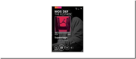
Next up was the mini view; I had experiences of the mini view(s) of many other media players but this looked cooler (yes, I am sounding biased, but you have to try it out yourself to believe me).
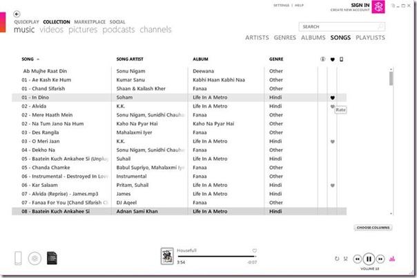
There were two other major views that looked astounding to me and if you are like me and keep your music organized and updated, editing even the least used tags of the individual MP3 songs you would love what this software has in store for you.
The collections view looked really simple to me, just displaying enough information as I would need and abstracting away the chores of it. Also, this window links you to all the major functionality of the software. Notice the sign in option that connects you to the world (literally).
The final screenshot I wanted to share was that of the edit screen which to say the least, lived up to my expectations:
This post was never intended to be a product review of Zune software, rather it just wanted to express the really innovative, unobtrusive UI design that seems to be taking the threshold now a days with consumer software.
Leave out your comments (if any) about your experience with the Zune software or any other application that stood out from the rest.
Must admit, the primary reason that made me inclined to try it out was the fact that it was a WPF application (that’s geeky, but then that’s what the developer in me is).
Happy listening!


No comments:
Post a Comment